Warning there are spoilers ahead, though as this show is 30 years old this year I really think the window of spoilage has long past.
I think I talked about Episode 1 ages ago, and indeed may have not imported that post to the Awesome Engine yet. And Episode 2 had far too much of that blue hair moppet that was apparantly foist upon Matsumoto. Orphantainment at it’s most annoying.
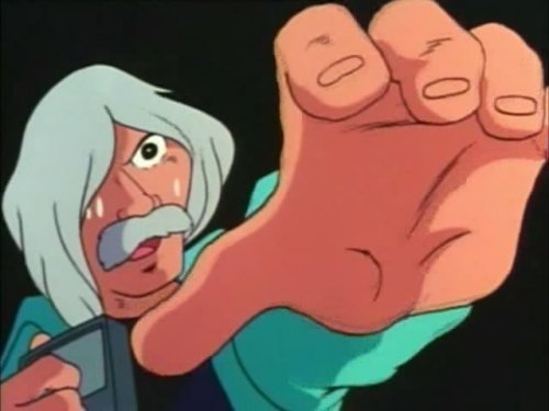
Episode 3 however had Professor Daiba getting killed, and that was awesome.
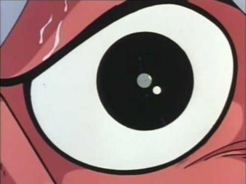
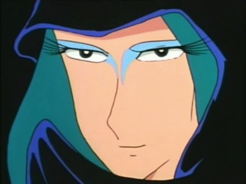
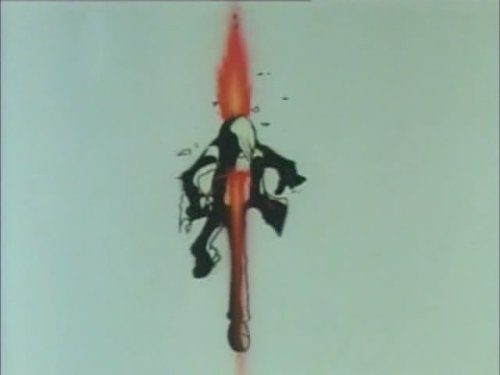
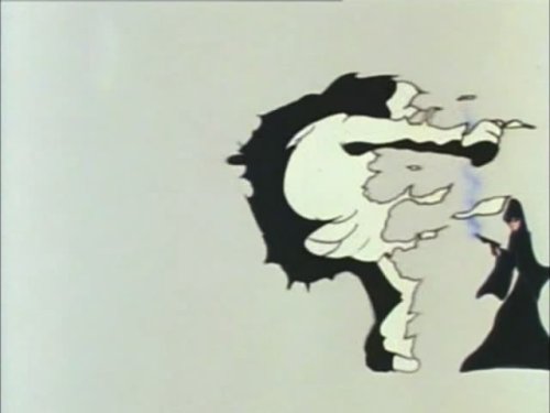
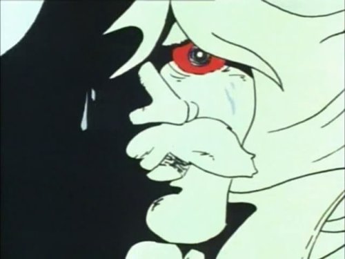
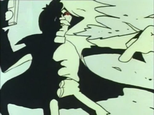
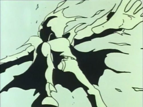
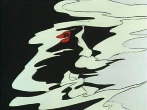
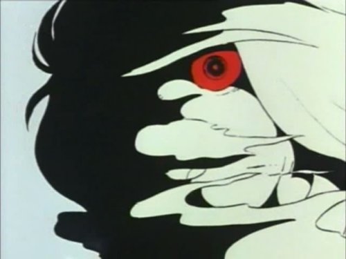
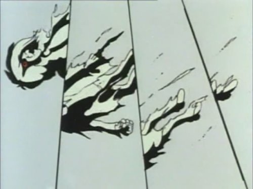
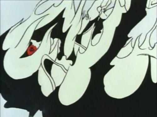
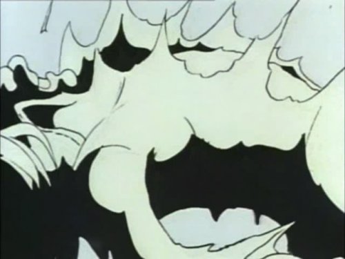
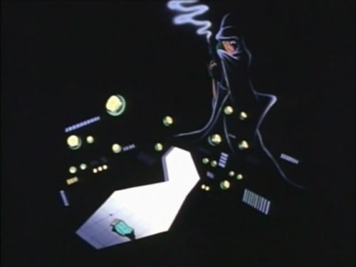
He is shot by a Mazone assassin, and as the shot connects the style of animation used to animate Daiba changes. The colours change to just black, white and red. The animation changes from pose to pose to this continuous, fluid motion. In death, Daiba has more movement to him than most of the characters do in the show. He certainly has more movement than his cold, static killer.
The effect is fantastic, the move to a more abstract animation, given to expressing the feel of the moment, rather than the reality of the moment, works wonders. Also the feeling I got when I first watched it was one of wishing you saw this sort of experimentation in mainstream anime nowadays. Even something like Gurren Lagann, which experimented with different styles on occasion, felt more in the realm of homage and pastiche. Or in the case of episode 4, was the subject to vocal criticism for being different. (Roll on the DVD release so I can properly do an episode by episode look at GL!).
Whereas with a lot of anime you can easily break down a scene shot by shot, or even frame by frame, this scene has such movement and flows so well, I’d be posting a ridiculous number of images to show you just how awesome it is. So here’s just a few to give you a taste of how it goes from shot to shot.

So, anyone know who animated this scene?