Guin Saga Episode 1

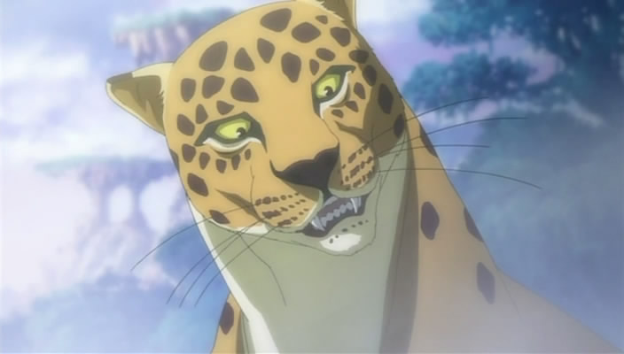
Based on a long winded series of fantasy books I’ll never read, this is merely average when it should be good. The first and most glaring problem is the character design. It’s bad enough that it’s fairly generic, but the actual crux of the problem is that it’s also too complicated. The outfits worn by the prince and princess are far to detailed to allow them to be animated well throughout in a 25 minute episode. That, combined with the fact it’s based on a novel, gives it a feeling it’s a show created by non-animators that animators then have to do their best to get on the screen. But even they don’t escape criticism. as this is another show where they use THAT colour palette. The one where they colour everything in a washed out pastel, so they won’t stand out when they start throwing lighting effects at them in scenes.
07-GHOST Episode 1

This suffers a little too from THAT colour palette, but comes through stronger given it’s thematic uses of black and white. And of course, having a visual origin in a manga helps somewhat too. The downside of that origin are some incredibly uninspired character designs, that removes what subtle differences there might have been between the vast amount of bishounen characters in the manga. Beyond that, it’s pretty well executed, and the whole military vs. church aspect has it’s merits, but I’m not the audience for this sort of thing. Fantasy and indistinct design are two speed bumps I can’t get over when combined.
Sengoku Basara – Episode 1

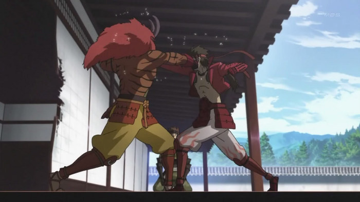
Pokemon may have a challenger to it’s best video game adaptation crown. I have no idea if the video game has the same genius idea of interpreting the warring clans as rampaging biker gangs on horseback, it sure as hell works wonders here. And seeing as I’ve talked colours in the previous two shows, let us point out that THIS IS HOW YOU DO IT. Say what you like about Production IG, they know what they are doing when it comes to digital animation. Unlike Satelight and Studio Deen, they get that just because you have millions of colours at your disposal, you don’t have to show off and use colours you’d never, ever, have used in hand painted animation. The differing armies have nice vivid, clear colours, that are acentuated by character designs that leave plenty of space to put those colours. They use lighting effects for night, fire etc scenes, but unlike Guin Saga, because the colours are strong enough to begin with you don’t get the whole scene washed out by the lighting.
And the script is OTT to the point of being silly, and it knows this, so has a least one character in there to point out just how silly it is. Which is great. Can’t wait to watch episode 2 which I’m told ups the animation stakes to glorious levels.
Marie & Gali – Episode 1

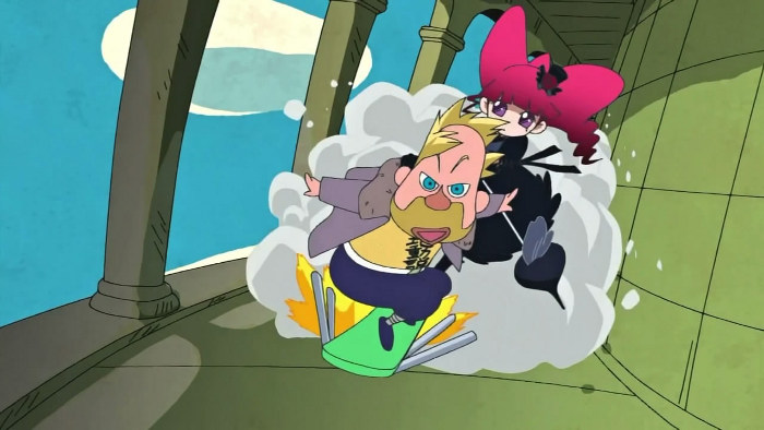
Yes, it is Edutainment. But it looks glorious. May have the best design sense since BONES adapted Soul Eater. The peak in animated physics lessons has been achieved!